-
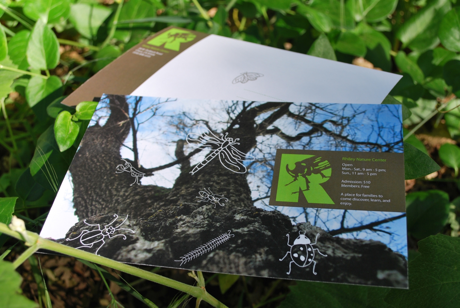
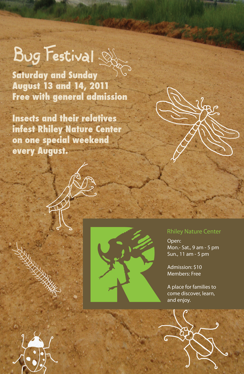
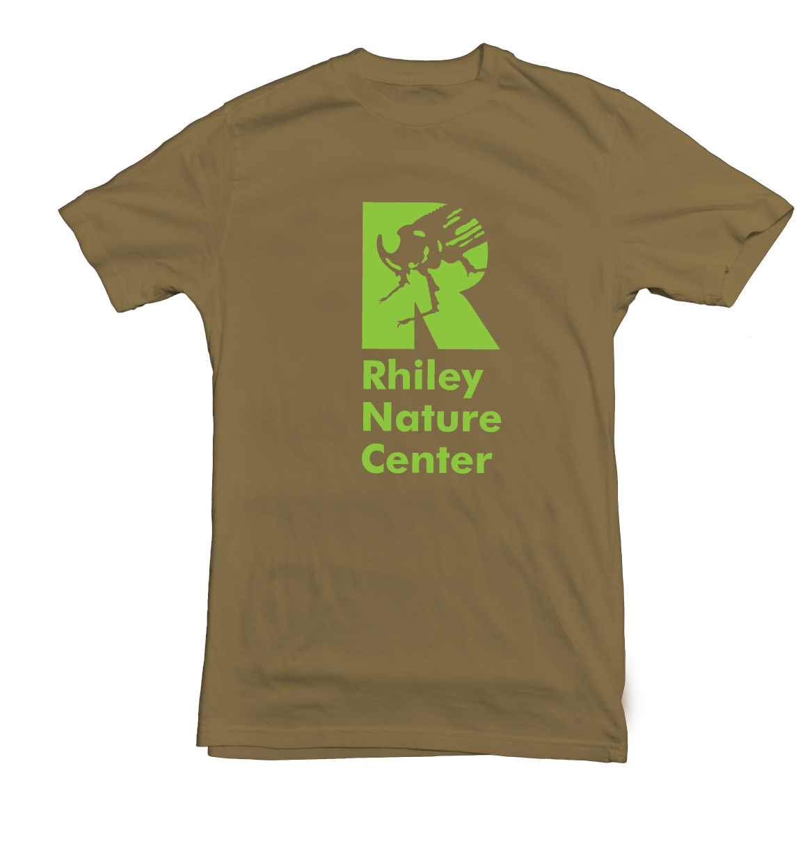
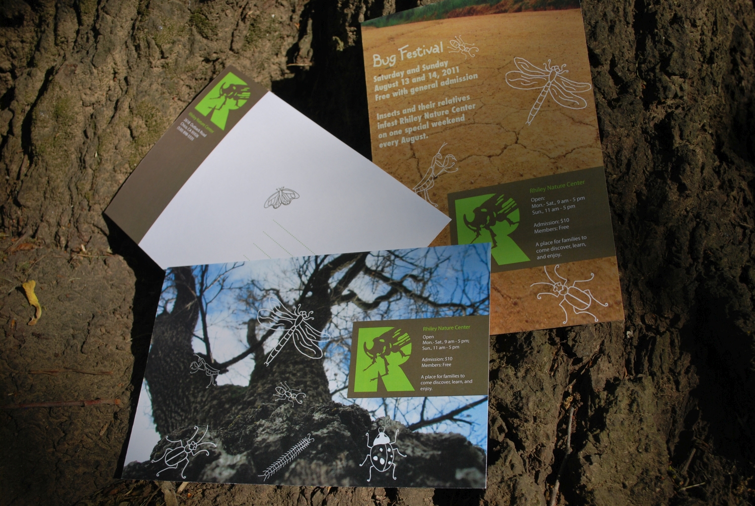
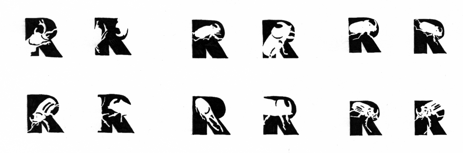
Rhiley Nature Center
This logo mark, promotional flyer, and T-shirt design is for the fictitious Rhiley Nature Center, was made for a letterforms class assignment. I focused on the theme of bugs, and used a figure-ground relationship to create a memorable mark, combining the bold “R” and the shape of a rhinoceros beetle. The colors of blue, green, and brown are representative of the earth and living creatures. The hand-drawn bugs on the flyer reflect a child-like quality that represents this center's main audience. The photograph of the tree I took from a low angle to capture the perspective of a bug and youth. -
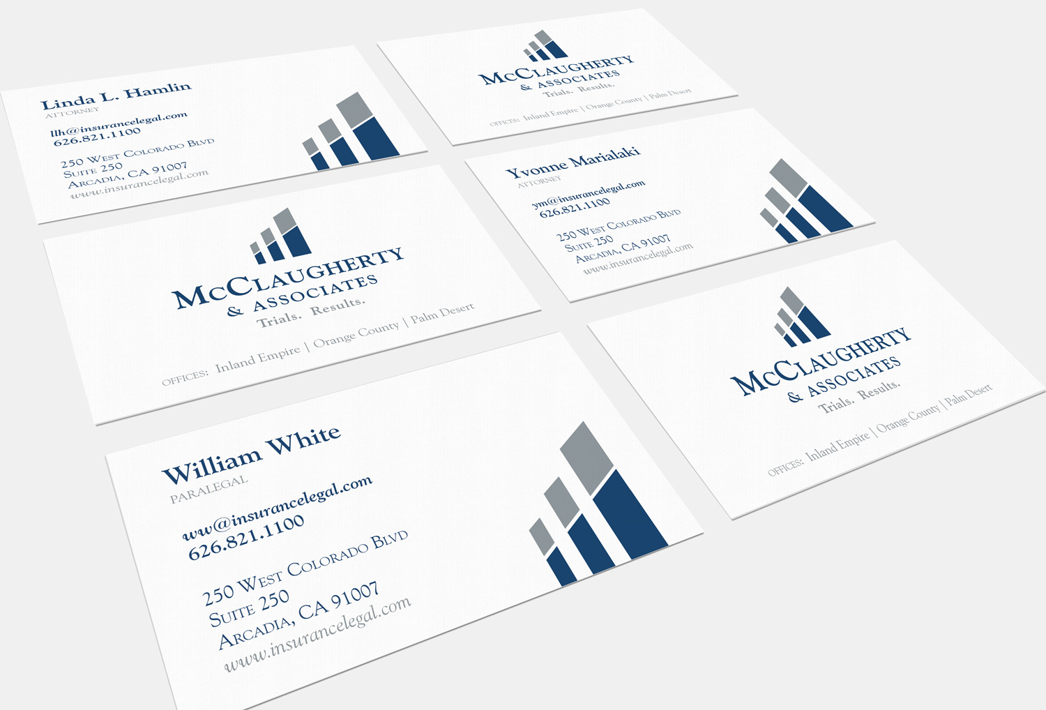
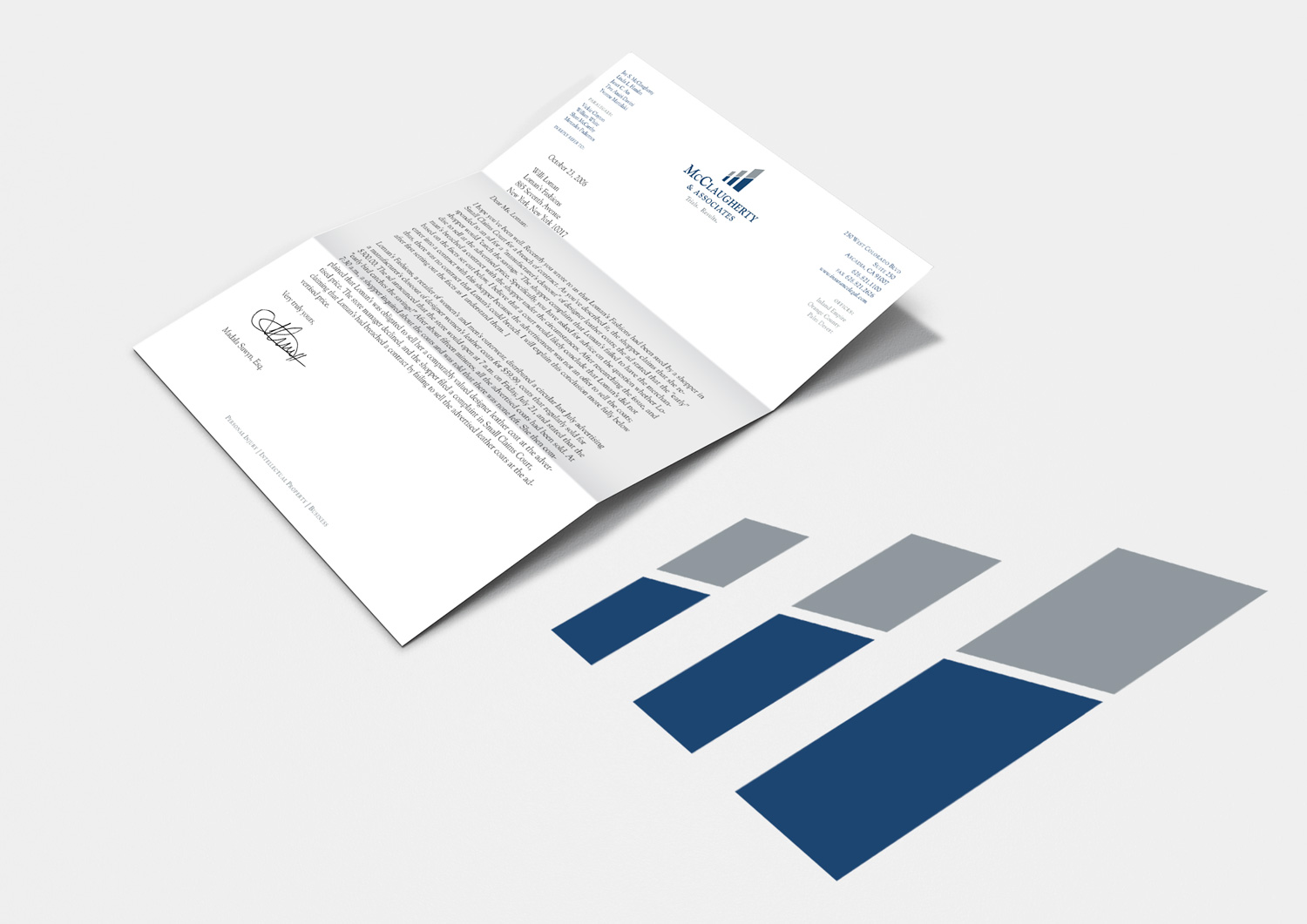
McClaugherty Law Firm
McClaugherty & Associates is a civil litigation firm located in Arcadia, California. Their brand identity reflects the firm's dependable and aggressive personality with the distinguished track record of 50 defense verdicts and an overall 93% success rate in nearly 100 trials. -
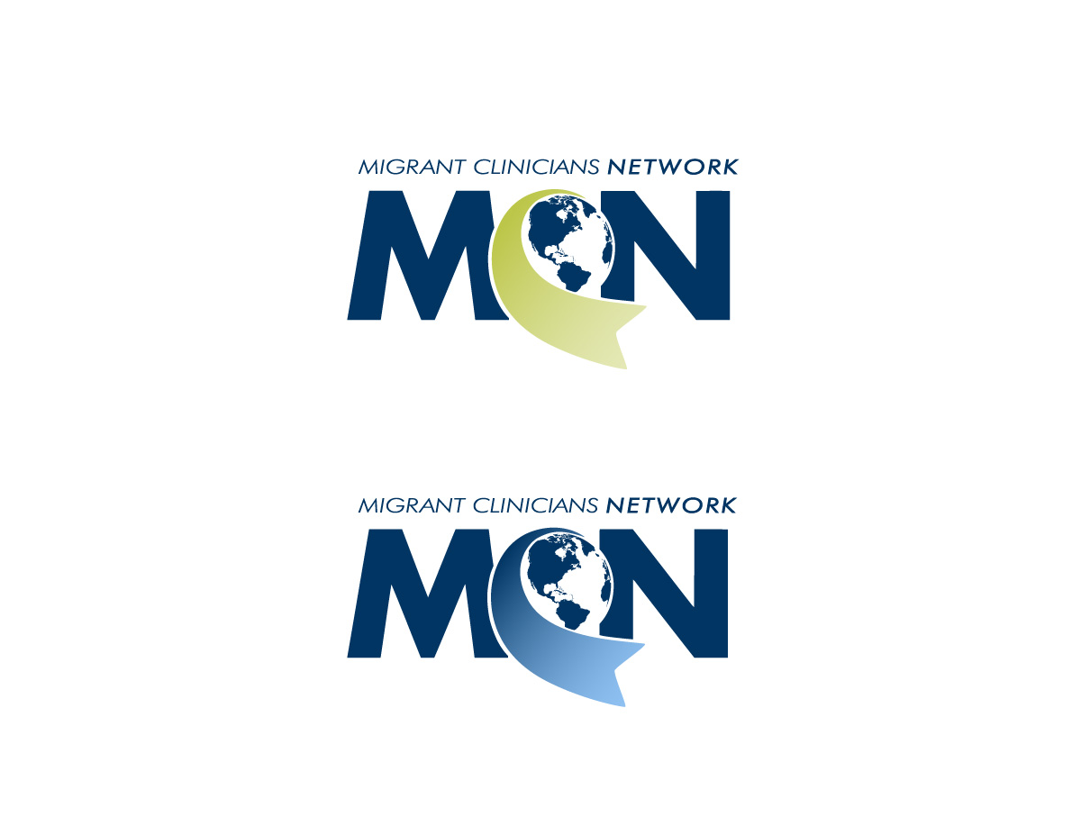
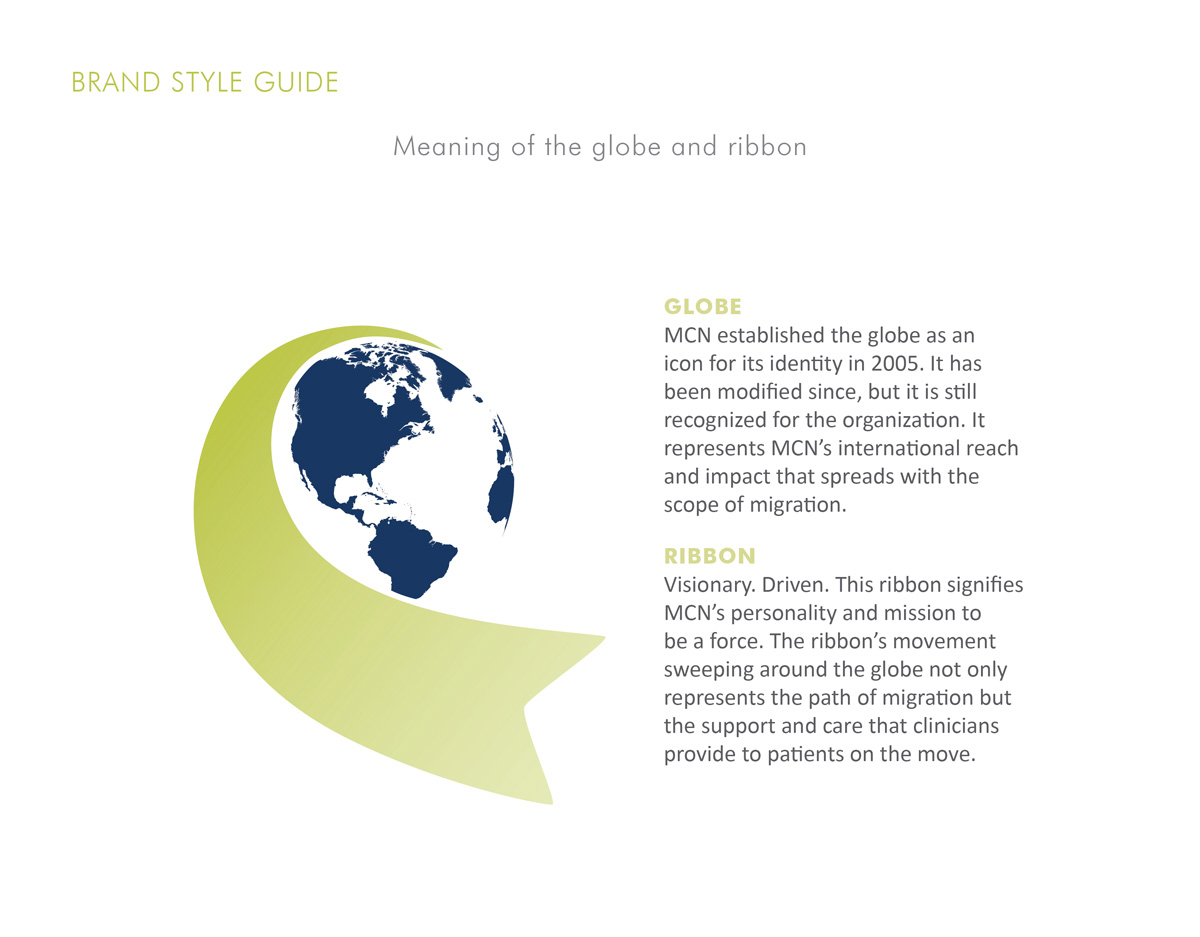
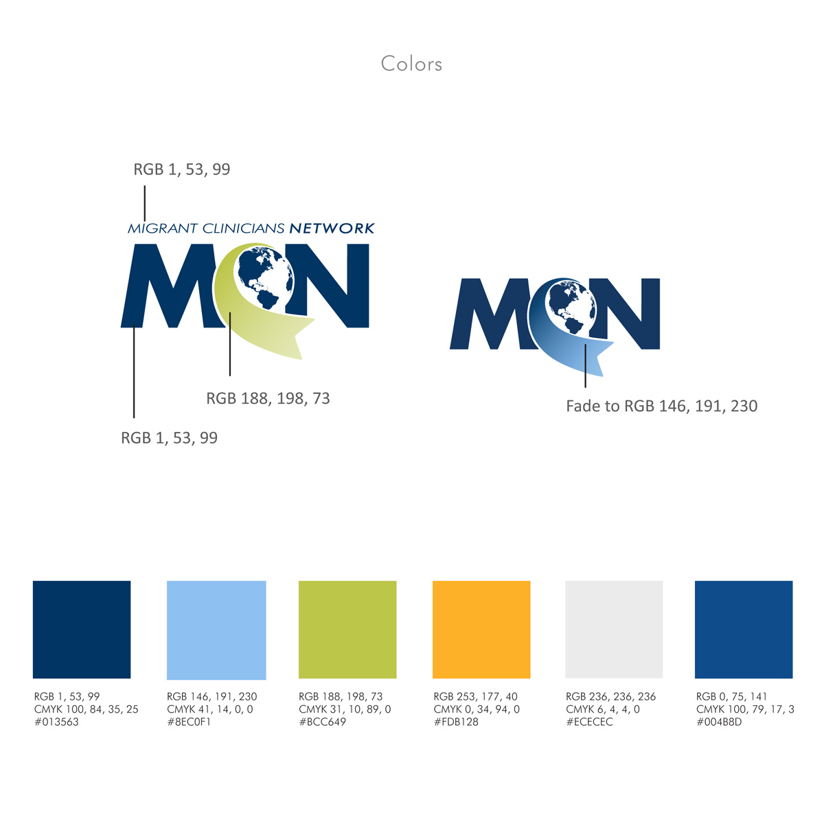
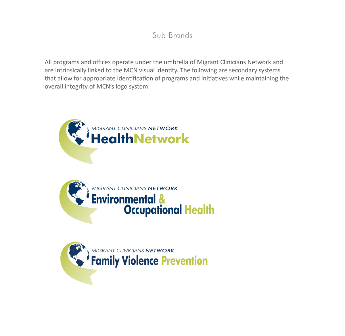
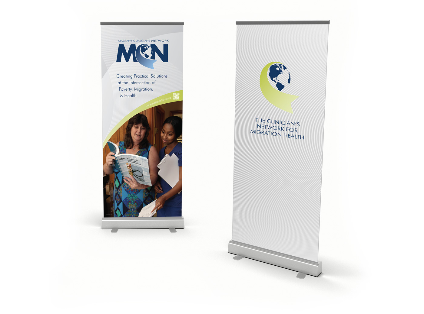
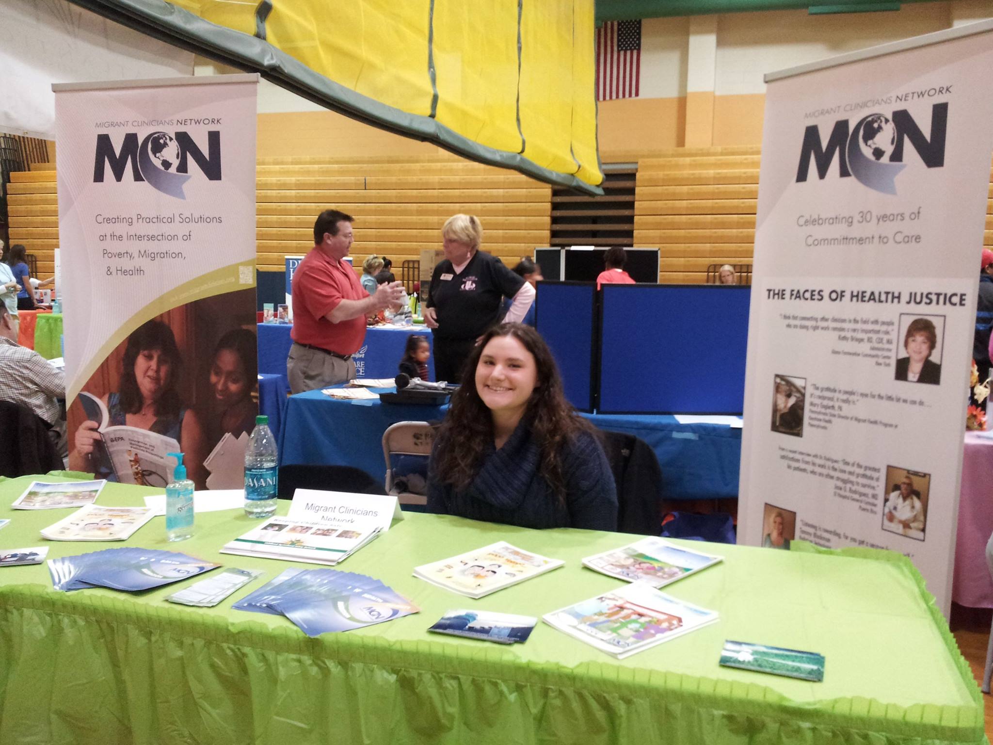
Brand Identity | Migrant Clinicians Network
Migrant Clinicians Network (MCN) is a non-profit organization that provides peer support, technical assistance and professional development to health professionals who provide care to migrant and seasonal farmworkers and mobile poor populations. They were looking to refresh their look without departing too much from their established colors and symbolic globe. The scope of this project included a new logo with 2 color treatment variations, a secondary logo mark with the organization tagline, sub-brand logos for individual programs, retractable banners for future conferences, and a style guide to ensure uniformity in all applications. -
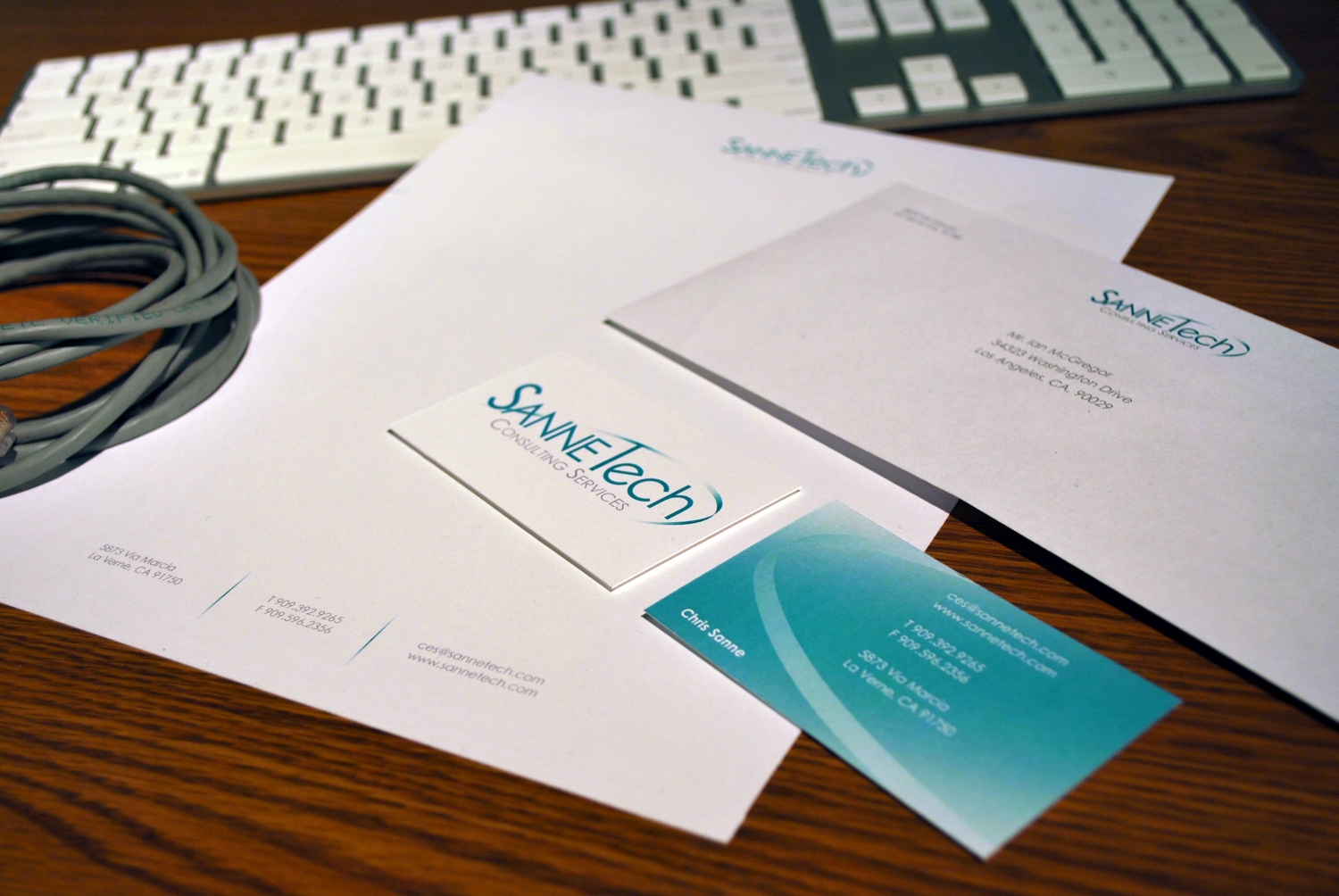
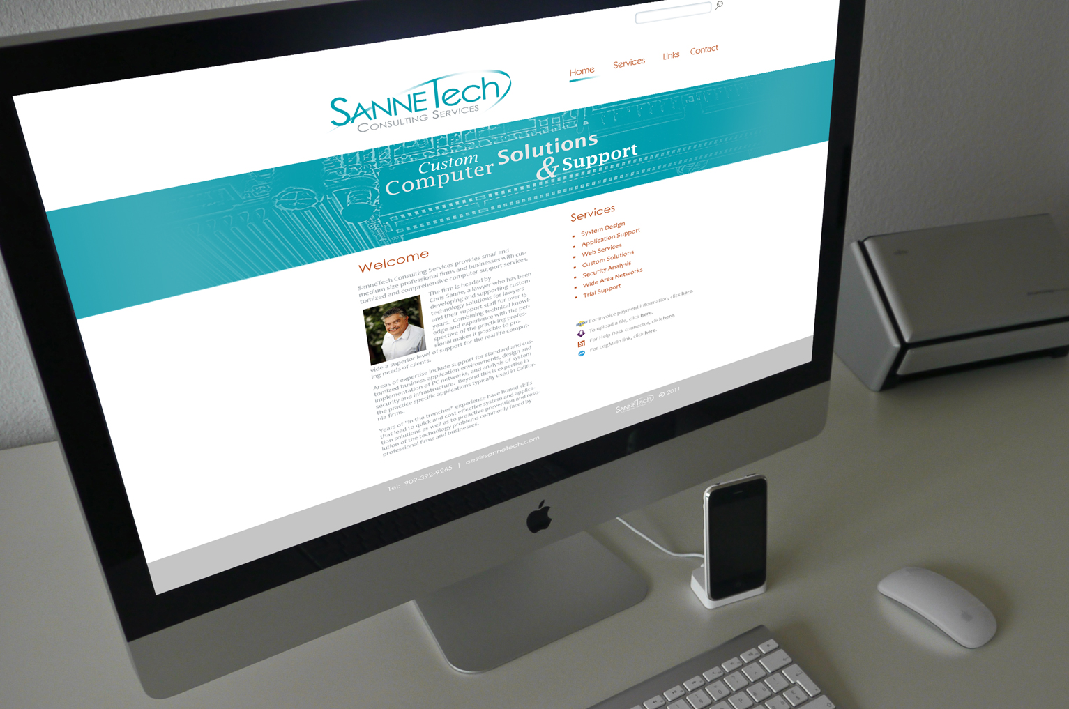
Sannetech Consulting Branding System and Website
This brand identity project includes an integrated business system and website layout design for a computer consulting company. I designed the logo to represent the all-encompassing nature of troubleshooting computers with a sleek gradient arc over the whole name. In addition, the line serves a functional role of finishing off the “T” and crossbar of the “a,” conveying a sense of thoroughness that reflects the personality of SanneTech Consulting Services. The teal that is consistent throughout the company’s identity was chosen to evoke a sense of loyalty within this small business. I designed a clean and minimal layout for the website to appeal to perspective clients and for ease of navigation.
graphic & web designer